From Words to Emotions: Selecting Fonts That Reflect Your Love Story
How to Choose the Perfect Fonts – Your wedding day is one of the most special days of your life. It’s the day you get to celebrate the love and commitment you share with your partner, and what better way to do that than by sending out beautiful, high-quality invitations that capture the essence of your love story? One of the most important elements of your wedding invitation is the font you choose. The right font can set the tone for your entire event and make your invitation stand out from the rest. In this article, we will guide you on how to choose the perfect fonts for your hardcover wedding invitations that will leave a lasting impression on your guests.
How to Choose the Perfect Fonts
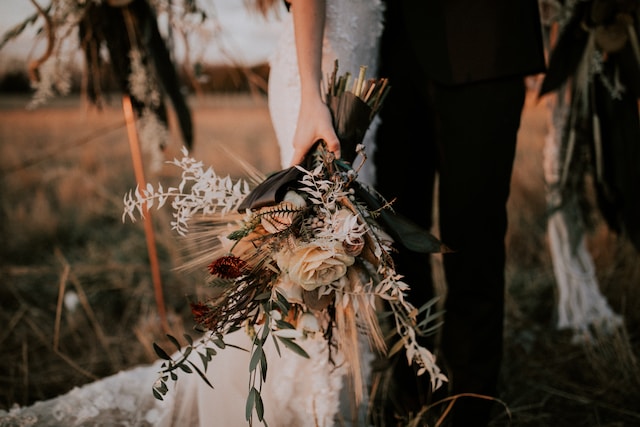
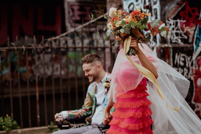
Consider Your Wedding Theme
Your wedding theme is the first thing you should consider when choosing the perfect fonts for your wedding invitations. Your fonts should complement the overall aesthetic of your wedding. For example, if you’re having a rustic-themed wedding, consider choosing fonts that have a hand-drawn or calligraphy-style look. If your wedding is more modern, consider sleek and elegant fonts with clean lines.
Determine the Tone of Your Wedding
The tone of your wedding is another crucial element to consider when selecting fonts for your wedding invitations. Do you want your wedding to be romantic and whimsical, or sophisticated and classic? Once you’ve determined the tone of your wedding, you can choose fonts that match the vibe you’re going for. For example, if you’re having a romantic wedding, consider using script or cursive fonts. For a more classic wedding, use elegant serif fonts.
Choose Readable Fonts
While it’s important to choose fonts that match the overall theme and tone of your wedding, it’s equally important to choose fonts that are easy to read. Your guests should be able to read your invitation without squinting or straining their eyes. Avoid overly decorative fonts or fonts that are too small. Stick to fonts that are clear and legible, even in small sizes.
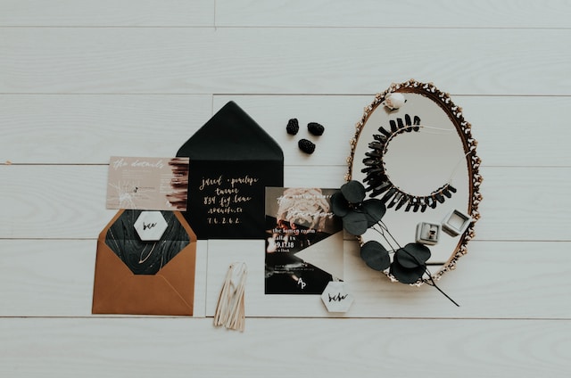
Mix and Match Fonts
Using multiple fonts can add depth and interest to your wedding invitations. Consider using a combination of serif and sans-serif fonts, or mixing bold and delicate fonts to create contrast. However, be careful not to go overboard with too many fonts. Stick to a maximum of two or three fonts to avoid overwhelming your guests.
Consider the Printing Process
It’s important to consider the printing process when choosing fonts for your wedding invitations. Some fonts may not print well, especially if you’re printing on textured paper or using a specialized printing technique like letterpress. Ask your printer for recommendations on fonts that will work well with your chosen printing method.
Test Your Fonts
Before finalizing your font choices, test them out to see how they look on paper. Print out a sample of your invitation using the fonts you’ve chosen and make sure they look as good on paper as they do on screen. You may also want to test different sizes and spacing to see what looks best.
Don’t Forget About Legibility
While it’s important to choose fonts that match your wedding theme and tone, don’t forget about legibility. Your guests should be able to read your invitation easily without any confusion or frustration. Avoid using cursive or overly decorative fonts for important details like the date, time, and location of your wedding.
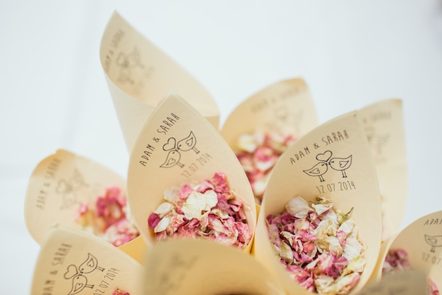
Get Creative with Typography
Typography is a powerful tool that can add depth and personality to your wedding invitations. Consider using creative typography techniques like bold lettering or decorative flourishes to make your invitations stand out. Just be sure not to overdo it, as too much creativity can make your invitations look cluttered and confusing.
Consider Accessibility
Accessibility is an important aspect to keep in mind when choosing fonts for your wedding invitations. You want to ensure that everyone, regardless of visual impairments, can easily read the information on your invitations. Opt for fonts that have good legibility and clear letterforms. Avoid excessively thin or overly stylized fonts that might be challenging for individuals with visual impairments to decipher. By considering accessibility, you show thoughtfulness and inclusivity towards all your guests.
Reflect Your Personal Style
Your wedding invitations should be a reflection of your personal style as a couple. Take the opportunity to infuse your unique personalities into the font selection. Whether you’re whimsical and playful or sophisticated and elegant, there is a font out there that will perfectly capture your essence. Explore different font options that resonate with your style and choose the one that speaks to your hearts.
Seek Professional Advice
If you’re feeling overwhelmed or unsure about choosing the perfect fonts for your wedding invitations, don’t hesitate to seek professional advice. Graphic designers and stationery experts have a wealth of knowledge and experience in creating visually stunning wedding invitations. They can guide you in selecting fonts that align with your vision and ensure a cohesive design that wows your guests.
Consider Consistency
Consistency is key when it comes to wedding stationery. Your fonts should not only be consistent throughout your invitations but also across all your wedding-related materials such as save-the-date cards, programs, and menus. This creates a cohesive and polished look that ties everything together beautifully. Choose fonts that complement each other and maintain consistency to create a seamless visual experience.
Pay Attention to Details
The little details can make a big impact on your wedding invitations. Pay attention to the finer aspects of typography, such as letter spacing, line height, and alignment. These details can enhance the overall aesthetic and readability of your invitations. Adjusting the spacing between letters or lines can create a more visually pleasing and balanced design. Remember, it’s the attention to these small details that sets apart an ordinary invitation from an extraordinary one.
Consider Future Trends
While it’s essential to choose fonts that are timeless and reflect your personal style, it’s also worth considering current and future trends. Wedding trends evolve, and fonts play a significant role in defining the overall aesthetic. Stay informed about emerging typography trends in the wedding industry and see if any resonate with your vision. Incorporating modern and fresh fonts can add a contemporary touch to your invitations, making them feel current and on-trend.
Trust Your Instincts
Ultimately, when choosing the perfect fonts for your hardcover wedding invitations, trust your instincts. This is your special day, and your invitations should speak to your heart. Select fonts that evoke the emotions you want to convey and align with your unique love story. Follow your intuition, and you’ll find the fonts that perfectly encapsulate the essence of your wedding.
How to Choose the Perfect Fonts – Conclusion
In conclusion, selecting the perfect fonts for your hardcover wedding invitations is a delicate balance of personal style, legibility, and aesthetics. By considering your wedding theme, determining the tone, and focusing on readability, you can choose fonts that create a lasting impression on your guests. Remember to mix and match fonts, test them, and be mindful of accessibility. Seek professional advice if needed, pay attention to details, and trust your instincts. With the right fonts, your wedding invitations will be a beautiful reflection of your love, setting the stage for a truly memorable celebration.
FAQs
What is the significance of choosing the right fonts for wedding invitations?
Choosing the right fonts for wedding invitations sets the tone and aesthetic of your event. It helps create a cohesive design that reflects your personal style and makes a lasting impression on your guests.
How many fonts should I use for my wedding invitations?
It is recommended to use a maximum of two or three fonts for your wedding invitations. Using too many fonts can make the design appear cluttered and overwhelming.
What should I consider when testing fonts for my invitations?
When testing fonts for your invitations, print out samples to see how they look on paper. Pay attention to legibility, size, and spacing. Ensure the fonts align with your overall design and are easy to read.
Can I use decorative fonts for important details like the date and location?
It’s best to avoid using overly decorative fonts for important details like the date, time, and location. Opt for clear and legible fonts that prioritize readability. You can incorporate decorative fonts in headings or accents for a touch of creativity.
How can I ensure my wedding invitations are accessible to all guests?
To ensure accessibility, choose fonts that have good legibility and clear letterforms. Avoid excessively thin or stylized fonts that may pose challenges for individuals with visual impairments. Prioritizing accessibility shows inclusivity and thoughtfulness towards all guests.
Remember, choosing the perfect fonts for your hardcover wedding invitations is an opportunity to infuse your personal style, create a cohesive design, and leave a lasting impression. Consider your wedding theme, the tone of your event, and the legibility of the fonts. Test different options, seek professional advice if needed, and pay attention to details. Trust your instincts and let your invitations beautifully express your love story. Celebrate this special moment with fonts that captivate hearts and set the stage for an unforgettable wedding celebration.
How to Choose the Perfect Fonts for Your Hardcover Wedding Invitations
Personalizing Your Invitations
At WalRay Invitations, we understand that every celebration is unique, which is why we offer a range of customization options to make your invitations truly one-of-a-kind. From adding your own photos or artwork to creating custom graphics and typography. So, we can help you create invitations that reflect your personal style and taste. Furthermore, with our range of envelope styles, colors, and thicknesses, we can create a cohesive and polished look for your invitations from start to finish. WalRay Invitations is proudly Australian owned and operated.